Friday, 11 December 2015
My Proposal
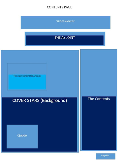
These are the softwares that I'll be using for my presentation. For question 7 I'll be using powerpoint.
Thursday, 10 December 2015
Friday, 27 November 2015
Thursday, 19 November 2015
Friday, 13 November 2015
Thursday, 12 November 2015
Tuesday, 10 November 2015
Friday, 6 November 2015
Link to my Youtube Video for Music Magazine
This video shows my presentation for my own music magazine called 'DVSRTY'.
Thursday, 5 November 2015
Tuesday, 3 November 2015
2. Photography Induction
This is the set that was set out for the preview example of the shoot. There's the cube lights (main light and fill light), the snoot, a black backdrop and a black chair placed in the center.
1.Photograph Induction
This is a reflector used in the professional photography equipment. This is used for the light for the man and the fill light to bounce off the reflector to get a good shade of an image.
Friday, 16 October 2015
Tuesday, 13 October 2015
Monday, 12 October 2015
Front Cover
This is the front cover of the XXL Edition featuring G-Unit.
This front cover is a very stereotypical cover because it represents black male rappers in a generic way. There are specific aspects on how XXL Magazine represent G-Unit (or G-Unit represent themselves), they use hand gestures to symbolise their characteristics of being hip hop rappers. The use of costumes is also typical but significant bease it allows them to embrace their individualistic ways on how much money they invest into clothes and jewelleries to wear. Gold chains, big jackets, hats, sunglasses, gold watches and rings are the common fashion wear that hip hop rappers wear to embrace their wealthiness.
The masthead (XXL) is at the right hand corner of the magazine appearing behind the artists. There are 2 colour schemes including red and black and a hint of y
Friday, 9 October 2015
Distribution of Magazines
Distribution of Magazines
Billboard Magazines
1. Do they offer subscriptions? Discuss reasons why.
Billboard Magazines do allow their consumers to access on a subscription, on a monthly subscription. They have three different types of subscriptions that consumers re able to pick and choose from,
- A Digital Access- which is only an iPad edition access which allows you to get the Daily Bulletin Newsletter into your inbox and give you Breaking News 24/7. For just $9.99 per month
- A Print Access- which also is an iPad edition access with 44 issues per year. This is also for just $9.99 per month.
- All Access- which is the Best Value that offers: iPad edition access, 44 issues per year, Breaking News 24/7, Over 50 year of of Billboard Charts plus Archives and a Daily Bulletin Newsletter to your inbox.
2.
Thursday, 8 October 2015
Evaluation, so far..
This just shows my evaluation so far, explaining on what I wanted to achieve and why I wanted and how I did it.
Tuesday, 6 October 2015
Friday, 2 October 2015
Case Studies: Front Cover
From these two music magazines covers, we can identify a range of differences form the magazines, Billboard and the Rolling Stones are both globalised and international receiving a lot of recognition and consumers purchasing see them.
Billboard
Mise -en-scene : Billboard cover shows Rap sensation, Eminem in a black background with a black, big hooded coat with a black top with the colour grey showing on the collar. The connotation of the colour black shows the use of the colour to infer to him being very dark, mysterious and dangerous. As a rapper, he is stereotypically being recognised because of his appearance, on top of that, he is also shown to be very mischievous and 'cool-looking' because he is not smiling in the front cover but he is giving a stern look towards the camera which gives us an audience that he is trying to make himself look intimidating and catch us off guard. This is a very typical pose for a rapper, he wants to embrace his masculinity amongst his fans/consumers. The lighting also emphasises on how intimidating he look because their darkness appearing on one side of his face and then there is 'normal' light appearing on the other side of his face. This infers that he has a dark side to him but people perceive as to being 'shone to the light', this shows versatility on how he has the best of both worlds. The hand on his chest can be identified to be that he is protecting his heart or that he is swearing upon an oath. This could be seen to be a spiritual gesture or just a 'cool rapper' gesture. The colour scheme is neutral with the colour scheme of white and green.
Rolling Stones
Mise-en-scene: Rolling Stones covers Pop sensation, Rihanna. Rihanna is known to be a female that is very confident in embracing her skin. There is no surprise in her wearing a white string vest with a necklace, diamond studs and her hair covering one side of her face. Her facial expression is the highlight of this cover because she looks pleasantly sexual and not lazy looking. She, again isn't smiling, this is a contrast because as her being a pop star you would expect to see her smiling and jumping around with full colour effect. However, the lighting is very bright making her makeup look flawless. The choice of pink for her lip wear relates to her pop antics. Her body language is slantly to the side and neck bent back, this is presented to reveal her skin so that she can the male sex attention. This is effective because it wouldn't just make her primary audience, females to purchase but along with her secondary audience, males would also want to purchase it too. She is grasping a diverse audience. The colour is very neutral with the choice of Black and white.
My College Magazine Cover
The best colour for my title is Red because its a bold and an attractive colour, so it would very easy for my audience to capture. The colour scheme is Blue and Yellow. I knew that these two colours compliment each other according to the contrast that the each colour connote. Blue connotes calm, tranquil and relaxation whereas yellow connotes to be very joyful, happy and full of energy And that's exactly what I want to promote for magazine, for it to stand out and make people feel happy to purchase it and are willing of purchasing it again instead of it being a waste of money. I want them to be able to stay calm during their exams instead of being too peer pressured and stressed.
Thursday, 1 October 2015
Friday, 25 September 2015
Complete College Magazine Plan
This is justs an image showing how my 'College' magazine cover would look like once I actually come to creating it. You can identify that my colour scheme is Red and Blue because I feel that the colours create contrast because Red is connoted to be very fiery, evil and vicious. Whereas, blue is mainly conoted to be very warm, cool and relaxed tone of colour. This means that my target audience (youths in education) can appeal towards the magazine because the two colours really compliment each other. I used some conventions/concepts that you'll see mainly in a music magazine but because it is a college magazine, I have to keep into consideration that the student has to be smiling towards the camera (or away from the camera) and holding some books and a bag because the props are what makes the college magazine be what it is.
Thursday, 24 September 2015
College Magazines v. Music Magazines
Music magazines and College magazines differ from each other and they both have some sort of similarities in which way they can be both expressed to be magazines so that they could appeal to their audience.
Similarities
- They both have a colour scheme usually it's 2 colours so that the cover could look professional.
- They both have a barcode
- They both have a master head line
- They both have an issue number
- They both have a price
- They both have mode of address.
- Sometimes they use cover stars in College magazine.
- Mise-en-scene, in music magazines they don't show someone with a educational books to promote education in school.
- Normally, in college magazines, they'll show a student(s) instead of a cover star.
- On the front cover, you'll mainly see the student (in the college magazine) smiling rather than grinning or having a neutral face/model 'smize' on a music magazine.
Tuesday, 22 September 2015
Monday, 21 September 2015
Friday, 18 September 2015
Welcome to my Blog
WELCOME...
This is my first new blog. My name is Julia Safilia-Lufuankenda. I am taking AS
Media as one of my courses in Leyton Sixth-form College. I’ve never used
In-Design before, I’ve only used it when I started taking Media as my one of my
A Levels. Feel free to explore and enjoy my progress through AS Media in this blog.
Thank You.
Subscribe to:
Comments (Atom)


